Pages

Friday, January 01, 2016

Master Bedroom Reveal

It's been a month or so now since I first mentioned on Facebook that I had given my master room as makeover and gave a little sneak peek. I got all new furniture, new linen, the lot! The only thing I didn't change was the wall paint (Dulux Flooded Gum).

I wanted my room to feel more airy and spacious and I think I have achieved this with smaller, lighter furniture and the soft colour scheme.

Here is a reminder of my bedroom before (click here). I loved the bright colour and I know this quilt cover set was/is popular but my new room is so much more 'me'.

  Bed Linen is all from Adairs except the throw is from Kmart
This is my bedside table - side tables are Kmart but I switched the handles to leather pulls from Interior Motives. I use the candle holder to hold my wedding rings when Im not wearing them.
 Hubby's side with a simple print I made in a marble frame from Spotlight. The pendants are from Beacon  - Husk 27cm
 Across from our is this set of drawers from Ikea. The large black vase was originally a citrus colour which matched our previous room.

 I was sent this lovely clock from Purely Wall Clocks which have pink/copper hands on wooden block.. it matches my room perfectly. You can get yours here
On the left is the vase of sand from our sand ceremony at our wedding. I made couple of prints to suit our room. The 08 represents our wedding date (08.08.08)
Lastly of course I kept our huge wedding photo. I changed the frame and moved to another wall. Not having a big shelf here has also helped open up the space.

Thursday, October 01, 2015

My New Study/Workspace: Lime And Mortar HQ

A couple of months ago I shared with you my monochrome/mint Kmart hacks (see this post) that I did ready for my new work space. My work space is finally completed and I have been trying to get the time to take photos to share with you.

To jog your memory this was my previous work space. It was bright and fun and I really liked it however spending many hours a day in there I started to feel like all the shelves were caving down on me, feeling cluttered and so on. I also really need some additional storage for all my supplies for my etsy business. See more photos of my old study HERE
And with all my work stuff

I removed all the gold triangles and replaced with a white brick wallpaper from The Wallpaper Company. This wallpaper is self adhesive ready to stick straight onto the wall. I sent a photo of the space I was planning to wallpaper before I ordered. After I placed my order I was contacted about printing the brick pattern the opposite direction and making it to large pieces for me. This was great customer service as I would have had to cut it into a number of pieces and match the brick pattern. Wall paper is great way to transform a space... see this wall in my ensuite.

I had doors added to cover the top 2 shelves. One section is full of books and the rest is storage and I don't need to worry about it looking nice or uncluttered. I also have strip of the darker wood laminate added to the top and bottom of the white shelving unit to frame it and match the new overheads.

The white doors with the white brick wall paper really brighten the space up. It feels more organised and calm. I added in mint touches as I really love mint and I think it is calming also.
Wooden Blacks: Lilly Pilly Arts

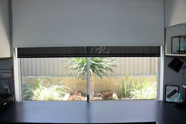
This corner is my main working area. I added the shelf to keep as much off the bench as possible. I have a lovely little garden outside. We plan to add a feature screen behind the tree at some point. Probably black to make tree pop and reduce the glare off the limestone/fence.

Meet Cleo and Porsha my sticker cutting machines. Porsha is a rebel though so I rarely use her. She just sits in the corner looking pretty.

This is the wall behind me. I stopped using the chalkboard calendar once I got my planner. I did a post about using pegboard (see post here) however I decided storage was more important and added large overheads which are full of supplies and perfect. So glad I have them!
Sorry it took me so long to share this space with you!

Monday, September 28, 2015

The Block-tagon: Week 3 Master Room and WIR

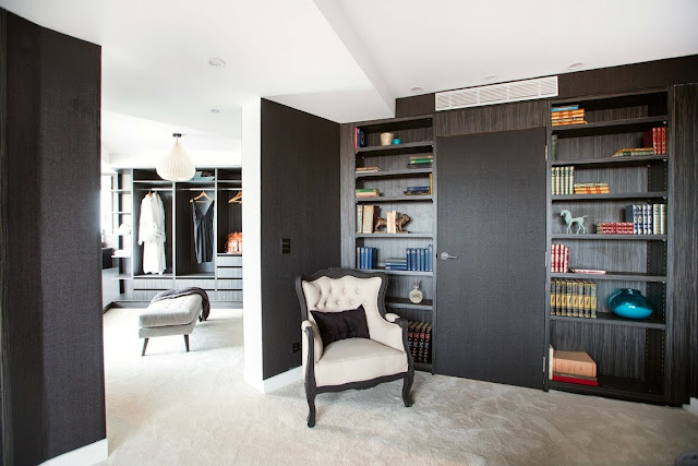
I cant say I love anyone's style so far this season. None of the master rooms were that nice. The WIR's however were lovely. Shay & Dean's is probably my favourite this week. I really dislike Carlo & Kingi's bed in middle of room. The graffiti makes it feel a bit like a teenagers room. Whilst Ebony & Luke may not be doing so well I love that they at least try to use colour.

The girls got a perfect score of 30/30 for their room this week making them winners!

FIRST PLACE: Suzi & Vonni

SECOND PLACE: Caro & Kingi

THIRD PLACE: Shay & Dean

FOURTH PLACE: Luke & Ebony

LAST PLACE: Andy & Whitney


Sunday, September 20, 2015

The Block-tagon: Week 2 Guest Room & Ensuite

This week was guest room and ensuite. Again those odd room shapes would be so hard to work with. Dean & Shay where this week's winners again by only 1 point! Guess blowing all that money on their bathroom in first week doesn't matter as much now they have won back $20k!

Sad to see Ebony & Luke in last place. I hope they can find more confidence and kick butt soon.

FIRST PLACE: Shay & Dean

SECOND PLACE: Caro & Kingi

THIRD PLACE: Suzi & Vonni

FORTH PLACE: Whitney & Andy

LAST PLACE: Luke & Ebony (love the sense of humour)

Shop this week's items:
1|2|3|4|5|5|6|6|7|8|9|10|11|12|13